

Your Website Is Either Making You Money or Costing You Money
High converting websites don’t happen by accident. They’re built with intention — every headline, button, image, and form is designed to move visitors toward one clear action.
Here’s a quick snapshot of what separates high-converting sites from average ones:
| Element | Average Website | High-Converting Website |
|---|---|---|
| Conversion rate | 1–2% | 6.6%+ (cross-industry median) |
| Page load time | 4+ seconds | Under 2 seconds |
| CTA design | Generic (“Submit”) | Action-driven (“Get My Free Quote”) |
| Mobile experience | Desktop-adapted | Mobile-first design |
| Trust signals | Minimal or absent | Testimonials, badges, case studies |
| Navigation on landing pages | Full menu present | Removed to reduce exit paths |
If your site gets traffic but not leads, the design is likely the problem — not your product or service.
Consider this: 75% of users judge a company’s credibility based on website design alone. And 53% abandon a page that takes more than 3 seconds to load. That means visitors are making a decision about your business before they even read a single word.
Most small business owners assume low conversions mean they need more traffic. But often, the real fix is making better use of the visitors already arriving. A site that converts at 6% instead of 1% effectively gives you six times the leads from the same ad spend or SEO effort.
I’m Brian Butrym, founder of NY Web Consulting — a results-driven web design firm based in Glendale, Queens — and I’ve spent years helping small businesses build high converting websites that are fast, search-optimized, and built to turn visitors into paying clients. In this guide, I’ll walk you through exactly what makes a website convert, and what common design mistakes are quietly draining your revenue.
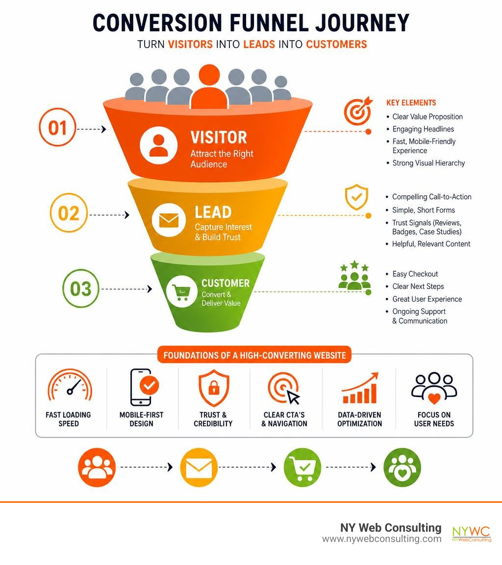
High converting websites glossary:
What Defines High Converting Websites in 2026?
In 2026, the digital landscape is more crowded than ever, and user expectations have reached an all-time high. A standard or institutional website is no longer enough to support a growing business. Traditional institutional sites act like digital brochures—they are passive, informational, and heavily focused on the company itself (“We are the top firm established in 1998”).
In contrast, high converting websites act like active, digital sales pipelines. They are deeply rooted in modern conversion psychology and are focused entirely on the user’s needs, fears, and goals. They align perfectly with search and user intent, guiding visitors seamlessly from their initial question to a logical next action.
To turn passive visitors into active buyers, you must understand what motivates them to act. We cover the foundational psychology behind user choices in The Ultimate Guide to Making Your Visitors Say Yes, which outlines how subtle nudges and strategic visual paths outperform loud, aggressive sales pitches.
Core Elements of High Converting Websites
Every high-performing website is built on a structured framework. If you look at the top-converting pages across any industry, they consistently share several key traits:
- A Clear, Benefit-Driven Headline: Your primary headline must communicate exactly what you do, who it is for, and what the customer stands to gain in under five seconds. Clarity always outperforms cleverness.
- Strong Visual Hierarchy: High-converting designs use size, color contrast, and white space to guide the reader’s eye naturally down the page. The most critical information and the call-to-action (CTA) should always stand out.
- Persistent Trust Signals and Social Proof: Modern consumers are naturally skeptical. They need to see verified customer reviews, partner logos, and industry certifications before they feel comfortable sharing their contact or payment details.
- Frictionless Lead Capture: Forms should be clean, short, and highly intuitive.
To see how these visual and structural elements work together on a single page, read our breakdown of the Anatomy of a Lead Generation Website.
The Psychology of the 3-Second Clarity Test
The “3-Second Clarity Test” is a brutal but highly accurate benchmark for website success. When a visitor lands on your homepage or landing page, they must be able to answer three basic questions within three seconds:
- What do you offer?
- How does it make my life better?
- What should I do next?
If your page fails to answer these questions instantly, your bounce rate will soar. High cognitive load—caused by cluttered sidebars, heavy blocks of text, or confusing jargon—forces the human brain to work too hard. When faced with high cognitive load, our natural instinct is to leave and find an easier alternative.
To prevent this, high-converting homepages structure their offerings into a clear “value ladder.” This means presenting a low-risk, high-value step first (such as a free guide, a simple audit, or a quick consultation) before asking for a major commitment. By reducing the initial friction, you match the user’s current attention span and build the momentum needed to guide them further down your funnel.
The Technical Pillars: UX, Speed, and Mobile Optimization
No matter how beautiful your design or how persuasive your copy, a slow, clunky website will never convert. The technical performance of your site forms the bedrock of the user experience.

According to Forrester Research, every dollar invested in user experience (UX) can generate up to $100 in return—an astounding 9,900% ROI. On the flip side, technical neglect directly hurts your bottom line. We specialize in turning slow, underperforming sites into high-speed sales tools through our website optimization services.
A critical component of this technical foundation is meeting Google’s Core Web Vitals. These metrics measure real-world user experience for loading performance, interactivity, and visual stability. To learn more about designing a site that keeps users engaged, explore our comprehensive guide to User Experience Design.
How Mobile Optimization Drives High Converting Websites
Mobile optimization is no longer a secondary design task. In 2026, mobile devices account for roughly 55% to 60% of all global internet traffic, and an incredible 83% of all landing page visits happen on mobile devices.
Designing for mobile first means restructuring how users interact with your content:
- Thumb-Friendly Navigation: Keep interactive elements, menus, and CTAs within easy reach of a user’s thumb.
- Responsive Layouts: Ensure your content stacks beautifully on vertical screens without requiring horizontal scrolling.
- Stripped-Down Mobile Pages: Large desktop video backgrounds and heavy scripts should be disabled on mobile to preserve load speed.
A famous real-world example of this is detailed in the case study of How Allbirds Rebuilt Its Shopify Storefront to Rescue Conversion – D2C Times. The global brand faced falling conversion rates due to technical debt and a bloated storefront with 34 third-party apps. By conducting a full app audit, removing redundant scripts, and dropping mobile page load times from 4.2 seconds to 1.8 seconds, they achieved a massive 31% conversion rate lift. They also replaced clunky pop-up size guides with inline expandable panels, reducing size-related product returns by 14%.
Eliminating Friction in Forms and Checkout Processes
Friction is the ultimate conversion killer. In forms and checkout flows, every extra field or unnecessary step acts as a hurdle that drives users to abandon the process.
To minimize friction, consider these best practices:
- Reduce Form Fields: Only ask for the absolute minimum information required to qualify the lead at this stage. You can always gather more details later.
- Use Progressive Profiling: For complex services, split long forms into a multi-step experience. Showing a visitor a 3-step progress bar is far less intimidating than presenting an 18-field form all at once.
- Modernize Checkout Architecture: Implement accelerated checkout options like Shop Pay or Apple Pay. In platform A/B tests, Shop Pay sessions have shown up to a 19% higher conversion rate than traditional guest checkouts.
- Keep Mobile CTAs Persistent: Use a sticky “Add to Cart” or “Book Now” footer on mobile devices so the primary action is always visible, no matter how far down the page the user scrolls.
To identify exactly where your visitors are getting stuck and dropping off, you need to map out their digital path. Learn how to optimize this flow with our guide on User Journey Mapping.
Strategic Elements: CTAs, Trust Signals, and AI Personalization
To turn interest into action, your website must utilize highly strategic, persuasive elements. This starts with how you prompt users to take action and how you establish your business as a trustworthy authority.
| Element | Standard Website Approach | High-Converting Approach |
|---|---|---|
| CTA Copy | Generic (“Submit”, “Contact Us”) | Action-oriented, benefit-focused (“Get My Free Quote”, “Start My Trial”) |
| CTA Color | Blends in with the overall page theme | High-contrast color that stands out instantly |
| Trust Signals | Generic stock badges or hidden text | Verified customer reviews, client logos, security badges |
| Personalization | Static, identical content for all visitors | Dynamic text replacement based on ad source or location |
Designing CTAs for Maximum Impact
Your calls-to-action are the most critical buttons on your website. An optimized CTA button can increase conversion rates by over 80%.
To maximize CTA impact, place your primary CTA above the fold (the area of the screen visible without scrolling) so it is immediately obvious. Use contrasting colors that naturally draw the eye, and write action-oriented copy that clearly explains what happens next. For example, instead of “Submit,” use “Get My Free Plan.”
To turn your entire site into a passive lead generator using these strategic placements, read our blueprint on How to Turn Your Website Into a Lead Generation Machine.
Leveraging Social Proof and Credibility Elements
Because 75% of users judge credibility by design, incorporating strong trust signals directly into your layout is essential.
- Verified Testimonials: Place real customer reviews near your CTA buttons. Whenever possible, include client photos or video testimonials, as including video on landing pages can boost conversions by up to 80%.
- Case Studies: Showcase real-world results. Use a clear “Problem-Solution-Result” structure to make your successes relatable and measurable.
- Security and Compliance Badges: Display SSL certificates, secure payment icons, and industry badges proudly. Additionally, ensure your site meets ADA compliance standards to build trust and guarantee accessibility for all users.
For businesses in the New York area looking to build high-performing, credible landing pages, working with localized experts who understand the NYC market is essential. A dedicated local partner can help ensure your digital presence is perfectly tailored to your target audience, aligning your design with the unique expectations of New York consumers.
Continuous Improvement: A/B Testing and Traffic Strategy
Building high converting websites is not a one-time project; it is an ongoing process of testing, analyzing, and refining.

To make informed decisions, we use advanced analytics tools to observe exactly how users behave on your site:
- Google Analytics: To track conversion goals, bounce rates, and user drop-off points.
- Hotjar Heatmaps: To visually see where users are clicking, how far they are scrolling, and what elements they are ignoring.
- Session Recordings: To watch anonymous recordings of real users navigating your pages, helping you spot friction points in real-time.
Implementing Data-Driven A/B Testing
A/B testing involves comparing two versions of a webpage against each other to see which one performs better. By testing one variable at a time—such as a headline, a CTA button color, or a form layout—you can make incremental, data-driven changes that lead to massive conversion lifts over time.
When running A/B tests, it is critical to wait until your data reaches statistical significance before declaring a winner. This ensures your results are due to the design changes rather than random chance. To learn more about maximizing your online revenue through continuous testing, read our guide on how to Boost Online Sales.
Aligning SEO and Content Strategy for Qualified Traffic
You can have the most optimized, high-converting website in the world, but it won’t generate revenue if you are attracting the wrong audience. To get the best results, your SEO and content strategies must align with high-intent keywords.
This means mapping your keywords to the customer’s journey:
- Informational Intent: “How to improve website conversion rates” (best targeted with educational blog posts).
- Transactional/Commercial Intent: “Professional web design services in Queens” (best targeted with optimized service pages).
By creating tightly structured topic clusters—where a comprehensive pillar page links to detailed, related sub-articles—you signal strong topical authority to search engines while keeping users engaged on your site longer. To build a comprehensive plan that attracts the right visitors, explore our strategic guide on How to Build a Winning Internet Marketing Strategy.
Frequently Asked Questions about Website Conversions
What is a good conversion rate for a business website in 2026?
The cross-industry median landing page conversion rate sits at 6.6%, though this varies significantly depending on your industry and offer. For example, SaaS websites typically see lower median conversion rates of around 3.8%, while high-performing industries like entertainment or finance can see medians of 12.3% or higher. Anything above the 6.6% benchmark is generally considered a strong, high-converting page.
How does page load speed directly affect conversion rates?
Page speed has a direct, measurable impact on user behavior. Google data shows that 53% of mobile users will abandon a page if it takes longer than 3 seconds to load. A slow site increases user frustration, destroys credibility, and causes your bounce rate to spike, which ultimately lowers your search engine rankings and wastes your advertising budget.
Why should we remove main navigation from landing pages?
Removing the main navigation menu from dedicated landing pages reduces exit paths and eliminates distractions. When visitors have fewer options, they face less decision fatigue. By funneling all of their attention toward a single, clear call-to-action, you significantly increase the likelihood that they will complete the desired conversion.
Conclusion
Your website is the digital face of your business, operating 24/7 as your hardest-working salesperson. If your current site is slow, cluttered, or failing to guide visitors toward a clear next step, it is quietly costing you money every single day.
Building a high-converting website requires a careful blend of speed, mobile-first design, trust signals, and clear copywriting. By eliminating technical friction and aligning your design with human psychology, you can turn your passive traffic into a consistent stream of qualified leads and sales.
At NY Web Consulting, we specialize in building lightning-fast, highly secure, and search-optimized websites that are engineered to convert. Located right here in Glendale, Queens, we help New York City businesses transform their digital presence into active lead generation machines.
Ready to stop losing leads and start growing your business? Explore our Professional Web Design Services today, or get in touch with our team for a custom website audit.