
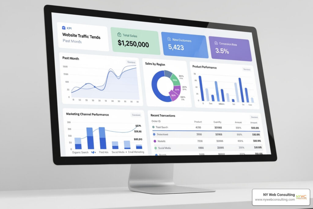
Why Dashboard UI/UX Design Matters for Your Business
Dashboard ui ux design is the art and science of organizing data into clear, actionable visual interfaces that help users make faster, better decisions. Here’s what you need to know:
Key Elements of Effective Dashboard UI/UX Design:
- Clarity – Display essential information first, with details available on demand.
- Consistency – Maintain uniform visual patterns, layouts, and interaction behaviors.
- Hierarchy – Place critical metrics prominently using size, color, and position.
- Responsiveness – Adapt layouts for desktop, tablet, and mobile viewing.
- Interactivity – Enable filtering, drilling down, and customization for deeper insights.
Like a car’s dashboard, a digital dashboard should show just enough to act safely and effectively. Clutter leads to missed critical information. The same principle applies to digital dashboards.
According to a 2019 Deloitte study, 67% of senior managers aren’t comfortable accessing or using data from their business tools. This is a massive problem when dashboards are meant to simplify decision-making, not complicate it.
Poor dashboard design leads to:
- Overwhelmed users and tool abandonment
- Missed insights buried in clutter
- Slower decisions from confusing navigation
- Loss of trust in the data
In contrast, great design transforms data into a strategic advantage, enabling quick trend-spotting and confident, data-backed decisions.
I’m Brian Butrym, and I’ve helped countless businesses turn complex data into clean, high-performing web experiences through thoughtful dashboard ui ux design. At NY Web Consulting, we specialize in creating fast, user-friendly interfaces that drive results-not confusion.
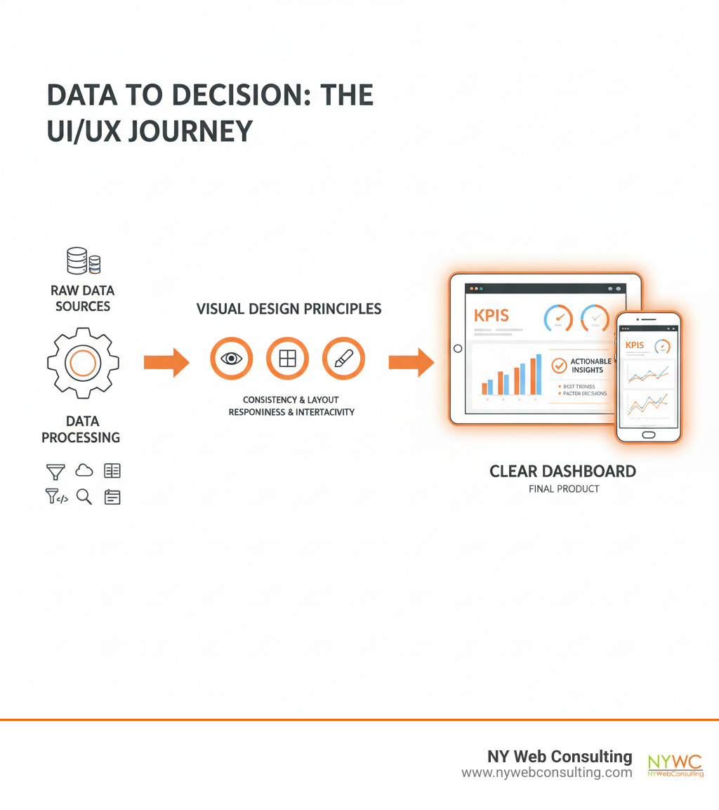
Dashboard ui ux design definitions:
The Foundation: Core Principles of Effective Dashboard Design
Great dashboard ui ux design delivers the right information at the right moment, just like your phone’s lock screen-no hunting required.
Every successful dashboard is built on core principles that ensure it provides insightful, actionable information at a glance. These aren’t just aesthetic choices; they are fundamental rules that ensure your dashboard serves its purpose.
Our approach to effective dashboard ui ux design focuses on three pillars: understanding user goals, supporting data-driven decisions, and building a solid information architecture. Our user journey design approach helps us nail all three by mapping how people actually interact with data in their daily work.
The primary goal is always clarity. Can users quickly interpret the data? Is the experience consistent? Does the dashboard provide clear feedback? These elements turn complex data into an intuitive experience, creating a clear conversation between the user and their data.
Understanding User Context and Personas
Before designing, we must understand who will use the dashboard and why. This is where user context and persona development become invaluable.
A common pitfall is the “just-in-case” mentality, which leads to over-engineered dashboards packed with features nobody needs. We’ve seen dashboards with twenty metrics when users only care about three.
We start by identifying the top one to three user types and their real information needs. Simple user personas-focusing on characteristics, pain points, and expectations-help us capture 50-80% of expected usage, which is usually enough to create something truly useful.
Through user interviews, we build a “need-to-know” list to uncover their actual challenges. What decisions do they need to make? What keeps them up at night? This helps us solve their problems, not just satisfy our curiosity about what’s technically possible.
User workflows and data literacy levels are also key. A dashboard for an executive making high-level strategic decisions will look very different from one for a frontline operator monitoring real-time events. The executive might need weekly trend analysis, while the operator needs instant alerts.
For more on understanding your users’ mental models, check out our guide on mapping the user’s mind: a guide to journey mapping.
The Three Main Types of Dashboards
Not all dashboards are created equal. Understanding the different types helps us tailor the dashboard ui ux design to its specific purpose and audience.
We typically work with three main types based on their primary function:
| Dashboard Type | Purpose | Primary Users | Data Focus | Key Characteristics |
|---|---|---|---|---|
| Strategic | High-level performance monitoring and long-term planning | Executives, senior management | Historical trends, KPIs, goals vs. actuals | Updated daily or weekly; focuses on “are we meeting our objectives?”; often includes year-over-year comparisons |
| Analytical | Deep-dive analysis and pattern findy | Analysts, managers, specialists | Detailed data sets, comparisons, correlations | Interactive with drill-down capabilities; supports “why is this happening?”; includes multiple visualization types |
| Operational | Real-time monitoring and immediate action | Frontline staff, operations teams, technicians | Live data, alerts, current status | Updated in real-time or near real-time; answers “what’s happening right now?”; emphasizes speed and clarity |
Strategic dashboards give leaders a high-level view of business objectives, showing metrics like quarterly revenue or market share.
Analytical dashboards are for exploration, allowing users to filter data, compare periods, and find patterns to answer the “why” questions.
Operational dashboards monitor what’s happening right now, like server status or support queues. Speed and clarity are paramount for spotting problems and acting fast.
Knowing which type you need is the first step toward creating a dashboard that people will actually use and trust.
The Blueprint: Structuring for Intuitive Navigation and Clarity
A great dashboard is like a well-organized kitchen: everything has its place, and the most-used items are within easy reach. That’s what we aim for when structuring dashboard ui ux design-a space where users can find what they need without thinking.
This approach rests on a clear visual hierarchy, balanced information density, and responsive design. When these elements are right, users spend their mental energy on insights, not on figuring out where things are.
Research on dashboard design patterns confirms that thoughtful structure makes all the difference between a dashboard that gets used and one that gets ignored.
Establishing a Clear Visual Hierarchy
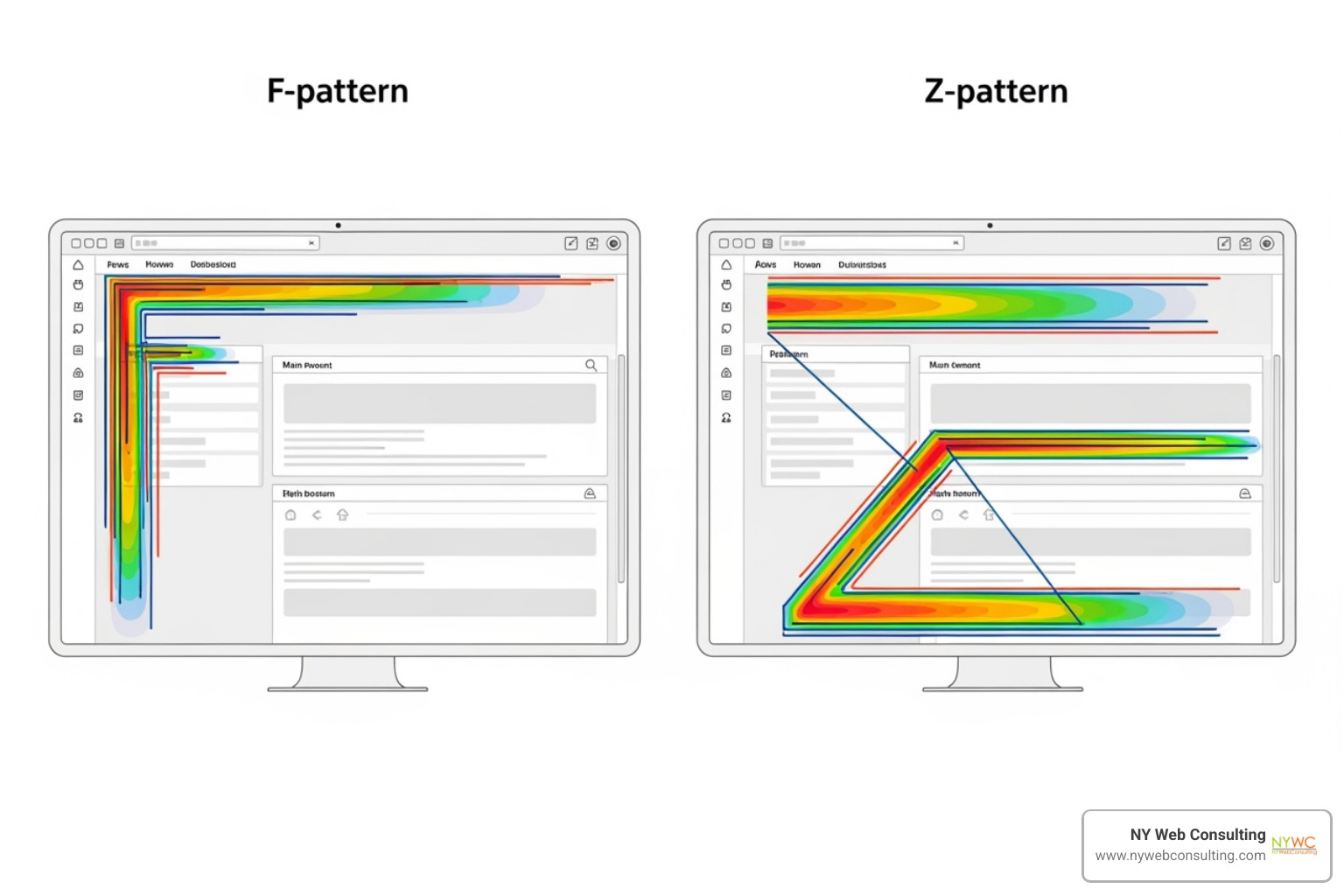
Users’ eyes follow predictable paths, like the F-pattern or Z-pattern. This means your most important metrics belong in the top-left corner-the screen’s prime real estate.
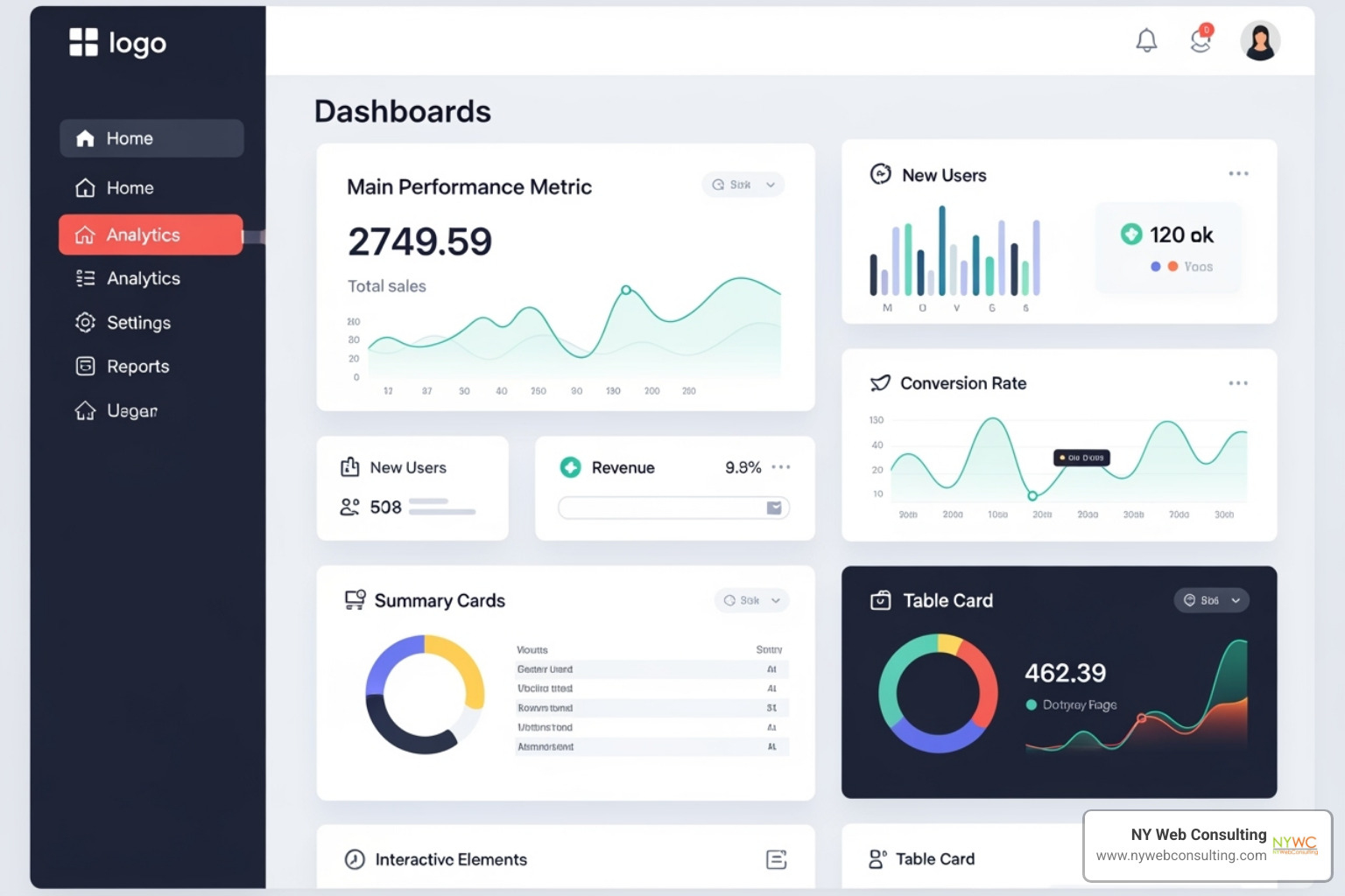
We’re fans of card-based design for organizing dashboard elements. Each chart or metric lives in its own visual “card,” which trains users to know exactly where to look for specific information.
Whitespace is a secret weapon. While it’s tempting to fill every pixel, generous spacing between elements helps users process information faster. We group related information together, moving from the most critical metrics at the top to more detailed breakdowns below, creating a natural flow.
Balancing Information Density with Usability
A constant challenge in dashboard ui ux design is showing everything versus showing what matters. Cramming too much data onto a screen creates a “data eyeball attack”-that overwhelming sensation that makes users want to close the tab.
The solution is progressive disclosure. We reveal details in layers, showing essential metrics immediately and tucking away secondary information until someone needs it.
Tooltips and hover states are perfect examples. Hover over a data point, and you get the details. Don’t hover, and your screen stays clean. We also use filters and drill-down options to let users explore deeper without cluttering the main view.
Sometimes the best design decision is simply showing less. We work with clients to prioritize which metrics truly drive decisions. This ruthless prioritization, combined with strategic use of whitespace, keeps dashboards manageable.
If you’re struggling to find this balance, our web development agency specializes in creating interfaces that put usability first.
Responsive Dashboard UI/UX Design for All Devices
Your CFO checking numbers on a desktop needs a different experience than a manager glancing at metrics on a phone. That’s why responsive design is essential, not optional.
We often start with a mobile-first mindset, asking: what does someone absolutely need to see on a small screen? This forces us to prioritize ruthlessly-maybe it’s just the top three KPIs.
Vertical layouts work beautifully on mobile, stacking information in order of importance. We adapt visualizations for smaller screens-sometimes simplifying charts, other times replacing them with summary numbers.
Touch-friendly targets are non-negotiable for mobile. Buttons and interactive elements need to be large enough to tap accurately. We test these experiences on actual devices, because there’s no substitute for feeling how a dashboard works in your hands.
The goal is seamless adaptation. A dashboard should feel like it was designed specifically for whatever device it’s on.
The Visual Language: Best Practices for Data Visualization and Interaction
Once the structure is solid, we focus on the visual language of the dashboard-how data is presented and how users interact with it. This is where dashboard ui ux design truly shines, changing raw numbers into stories that drive action.
The best data in the world is useless if it’s presented in the wrong format. The right visualization illuminates insights instantly, while the wrong one leaves users confused.
Choosing the Right Data Visualizations
We carefully select visualizations that best represent the data and support the user’s goals.
Bar charts are great for comparing categories. Line charts excel at illustrating trends over time. Scatter plots reveal relationships between two variables, and heat maps are fantastic for visualizing patterns in large datasets.
We approach pie charts with caution. Comparing slices can be difficult for users, especially with more than a few segments. A simple bar chart often conveys the same information more clearly.
The key is to match the chart type to the data’s story. For a deeper dive, the Data Viz Project examples offer a wealth of inspiration.
Using Color and Typography Effectively
Color and typography are powerful tools in dashboard ui ux design that guide attention and improve readability.
Smart use of color can provide layers of meaning, but accessibility must come first. We ensure high contrast and never rely on color alone to convey critical information, because roughly 8% of men have some form of color blindness. Incorporating patterns or icons provides additional visual cues that everyone can interpret.
Typography plays an equally vital role in visual hierarchy. Using bold, clear fonts for key numbers immediately draws the eye. We ensure typefaces are legible and appropriately sized across all elements to minimize cognitive strain.
Enhancing Experience with Interactive Elements
Interactive elements transform a static display into a dynamic analytical tool, fostering a sense of control and findy.
Tooltips and hover states are perfect for progressive disclosure, revealing details only when a user hovers over a data point. Filters and controls empower users to narrow down data and customize their view to answer specific questions.
Drill-downs allow users to click on a high-level metric and see a more detailed breakdown. Toggling variables helps users compare subsets of data in a chart. Sorting capabilities in tables or charts offer flexibility in analysis.
For advanced users, customization options like drag-and-drop module reordering can create a highly personalized workspace.
Interactivity is about respecting that your users want to explore their data, not just passively consume it. When we design dashboards at NY Web Consulting, we build in these interactive elements thoughtfully to improve the user experience.
Avoiding Pitfalls in Dashboard UI/UX Design
Even with the best intentions, dashboard design can go sideways. We’ve seen impressive dashboards sit untouched and watched users abandon good data tools because they were confusing or untrustworthy.
The good news is that most of these problems are avoidable. Successful dashboard ui ux design is about what you leave out, how you explain it, and whether users can trust what they’re seeing.
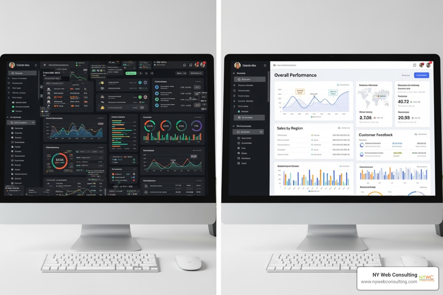
Common Mistakes in Dashboard UI/UX Design and How to Avoid Them
Here are the mistakes we see most often-and how to fix them.
-
Data overload: Trying to show everything at once overwhelms users. Fix: Be ruthless about prioritizing. Show only key metrics upfront, then use progressive disclosure (like tooltips) to reveal details.
-
Unfocused data: Including metrics just because you can creates a “rainbow salad” of charts that don’t tell a coherent story. Fix: Every metric should answer a specific user question. If you can’t explain why it’s there, it probably shouldn’t be.
-
Lack of context: A number like “3.2% conversion rate” is meaningless without context. Fix: Always include comparison points-historical trends, benchmarks, or goals-so users know where they stand.
-
Technical jargon: Not everyone knows what “CAC” or “LTV” means. Fix: Use clear labels and plain-language descriptions. Tooltips can define terms.
-
Poor color use: Relying solely on red and green is inaccessible to colorblind users. Fix: Use color thoughtfully, always pairing it with other visual cues like icons and ensuring high contrast.
-
“Just-in-case” features: Building complex features on assumptions leads to bloat. Fix: Focus on real pain points uncovered through user research, and add features only when users ask for them.
-
Inappropriate charts: Using the wrong chart type can make data harder to understand. Fix: Match the visualization to the data story to make insights immediately obvious.
Ensuring Data Accuracy and Trustworthiness
A gorgeous dashboard built on questionable data is worse than useless-it’s dangerous. Trustworthiness is just as important as visual design.
-
Data transparency: Users should never have to wonder where a number came from. Use labels or tooltips to explain sources and calculations.
-
Data freshness: Always include a “Last updated” timestamp so users know how current the information is, especially for time-sensitive data.
-
Helpful empty states: Instead of showing blank charts, display helpful messages like “No sales data yet” to guide users and prevent confusion.
-
Clear error messaging: Generic “Error” messages frustrate users. Explain what happened and suggest next steps, like “We couldn’t connect. Check your settings or try again.”
-
Context as a sanity check: When users can see current performance against historical averages, unusual spikes or drops become immediately obvious, helping catch data quality issues.
-
Export options: We always provide options to export raw data as CSV files. This respects that your dashboard is one tool among many and builds tremendous trust.
At the end of the day, avoiding pitfalls in dashboard ui ux design comes down to staying focused on real user needs, being honest about data, and resisting the urge to over-engineer.
The Future of Dashboards: Trends and Innovations
The world of dashboard ui ux design isn’t standing still. We’re constantly watching the horizon for emerging technologies and trends that will shape how businesses interact with their data.
-
AI-powered insights and augmented analytics are turning dashboards into proactive assistants. AI can suggest the best charts, automatically highlight anomalies, and even predict future trends.
-
Natural Language Processing (NLP) is making data exploration more intuitive. Soon, you’ll be able to ask your dashboard questions in plain English, like “What were our best-selling products last quarter?”
-
Personalization is evolving beyond basic customization. Future dashboards will learn your preferences, understand your role, and proactively surface the information most relevant to your goals.
-
The demand for real-time data and streaming visualizations continues to grow. Modern dashboards can display live data streams, allowing you to monitor critical KPIs and respond to changes instantly.
-
We’re even seeing experiments with spatial computing and immersive interfaces-think data visualizations you can walk through in 3D space, hinting at entirely new ways to understand complex datasets.
At NY Web Consulting, we stay ahead of these trends because we know that the best dashboard isn’t just effective today-it’s built to evolve with tomorrow’s possibilities.
Conclusion
In this guide to dashboard ui ux design, the key takeaway is this: clarity always wins over clutter. A dashboard should feel like a trusted advisor, not a puzzle that needs solving.
We’ve walked through the core principles that make dashboards work-understanding your users, structuring information so it flows naturally, choosing visualizations that make sense, and avoiding common pitfalls. The most effective dashboard ui ux design isn’t about showing everything you can measure. It’s about showing what your users need to know, exactly when they need it, in a way that makes their next decision obvious.
User-centricity is the thread that runs through every successful dashboard project. When you truly understand who’s using your dashboard and what they’re trying to accomplish, the design decisions become clearer.
At NY Web Consulting, we bridge that gap between data and insights. We take complex information and turn it into clean, intuitive digital experiences that actually get used. Because a dashboard that sits ignored is just an expensive screen decoration.
Whether you’re building a new dashboard from scratch or rethinking one that isn’t delivering results, the principles we’ve covered here will serve you well. And if you’d like some help bringing your vision to life, we’re always ready to roll up our sleeves and dig in.
Your data has a story to tell. Let’s make sure it gets heard.